The Stella health assessment
Restructuring the health assessment around education, clarity and trust

Role
Product & content designer
Industry
Healthtech, Femtech
Duration
2 months
— Overview ·
The Stella health assessment identifies an individual’s medical history, risk factors and menopause symptoms, generating personalised treatment options which can include medication, clinician appointments and access to the Stella lifestyle app.
As I came into my design role at Vira, we were looking to enter the US market and alongside the user researcher, we identified several opportunities to improve the flow for better clarity.
👩🏾💻 This was a cross-functional project. I worked closely with a dedicated user researcher who led the 21-person interview study; my role was sitting in user interviews & translating all findings into content and structural decisions. The engineering and clinical teams were involved in scoping what was technically feasible. |
|---|
— Research ·
We conducted user interviews and usability testing with 21 American women over 2.5 weeks.

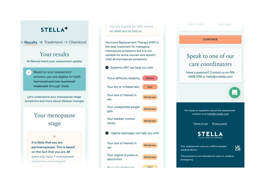
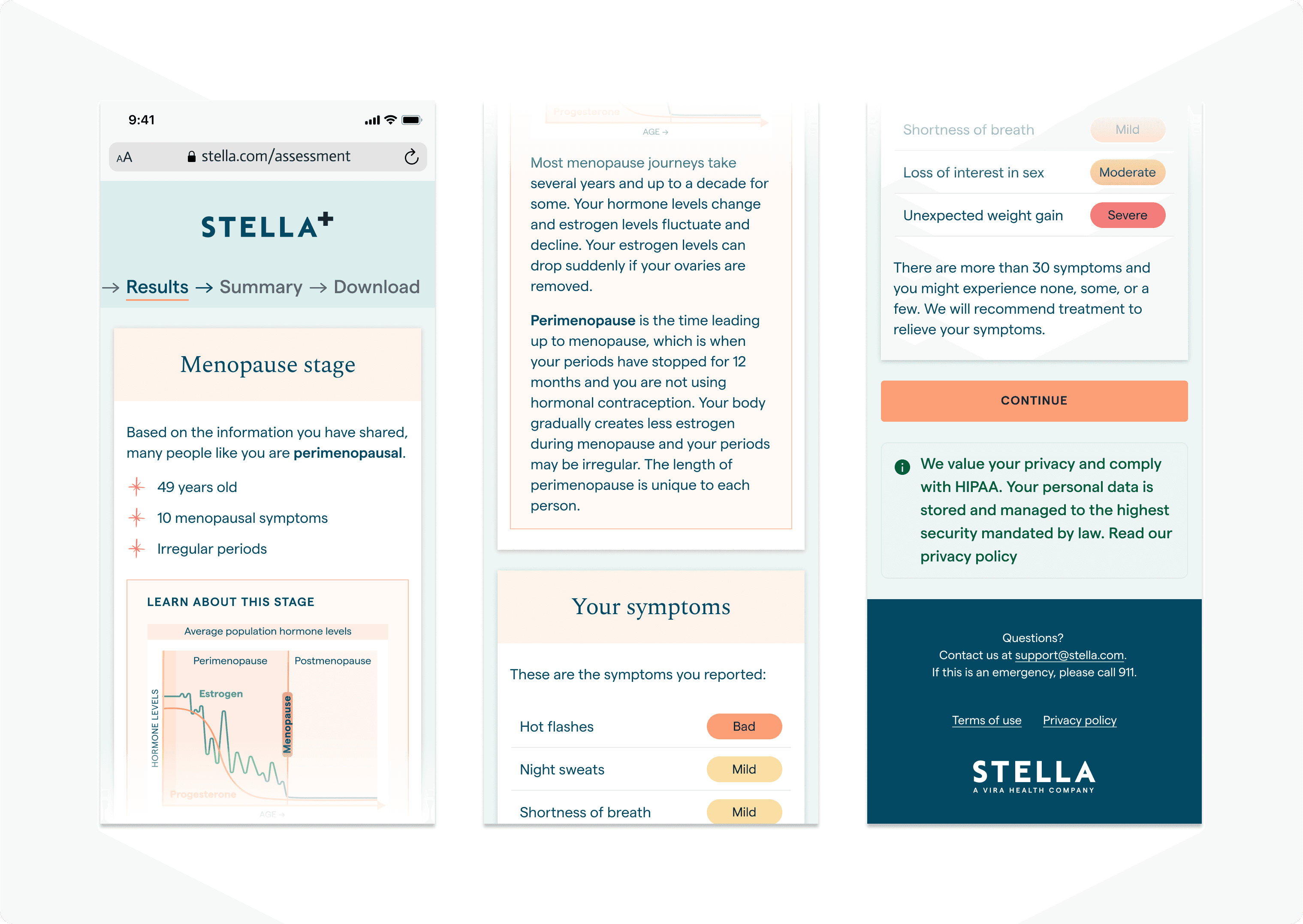
Focus area 1: Results page - Making menopause personal before making it medical
Before | After |
|---|---|
 |  |
|
|
⭐ Outcome: In usability testing, women described their options as clear and said the next steps made sense - including those who hadn't wanted to be offered medication.
Focus area 2: Turning a trust barrier into a trust signal
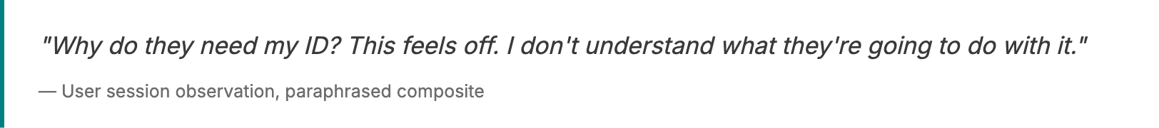
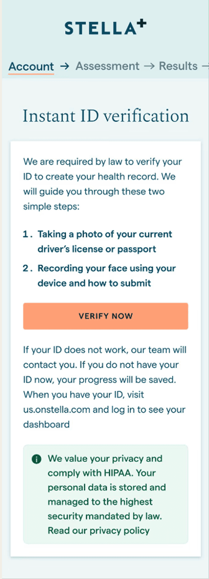
At the ID verification step, users were hesitating and dropping off. Research told us why: the language was too casual ("selfie" in a medical context), and there was no explanation for why ID was needed at all. Users felt confused and, in some cases, suspicious.
The fix was a content decision; rewriting the screen to lead with the legal basis for the requirement - establishing legitimacy immediately. Reducing the instructions to two clear steps. Once users understood why it was required, the hesitation disappeared.
Before | After |
|---|---|
 |  |
Two content decisions that fixed the drop-off

⭐ Outcome: ID verification completion increased from 12% to 19%.
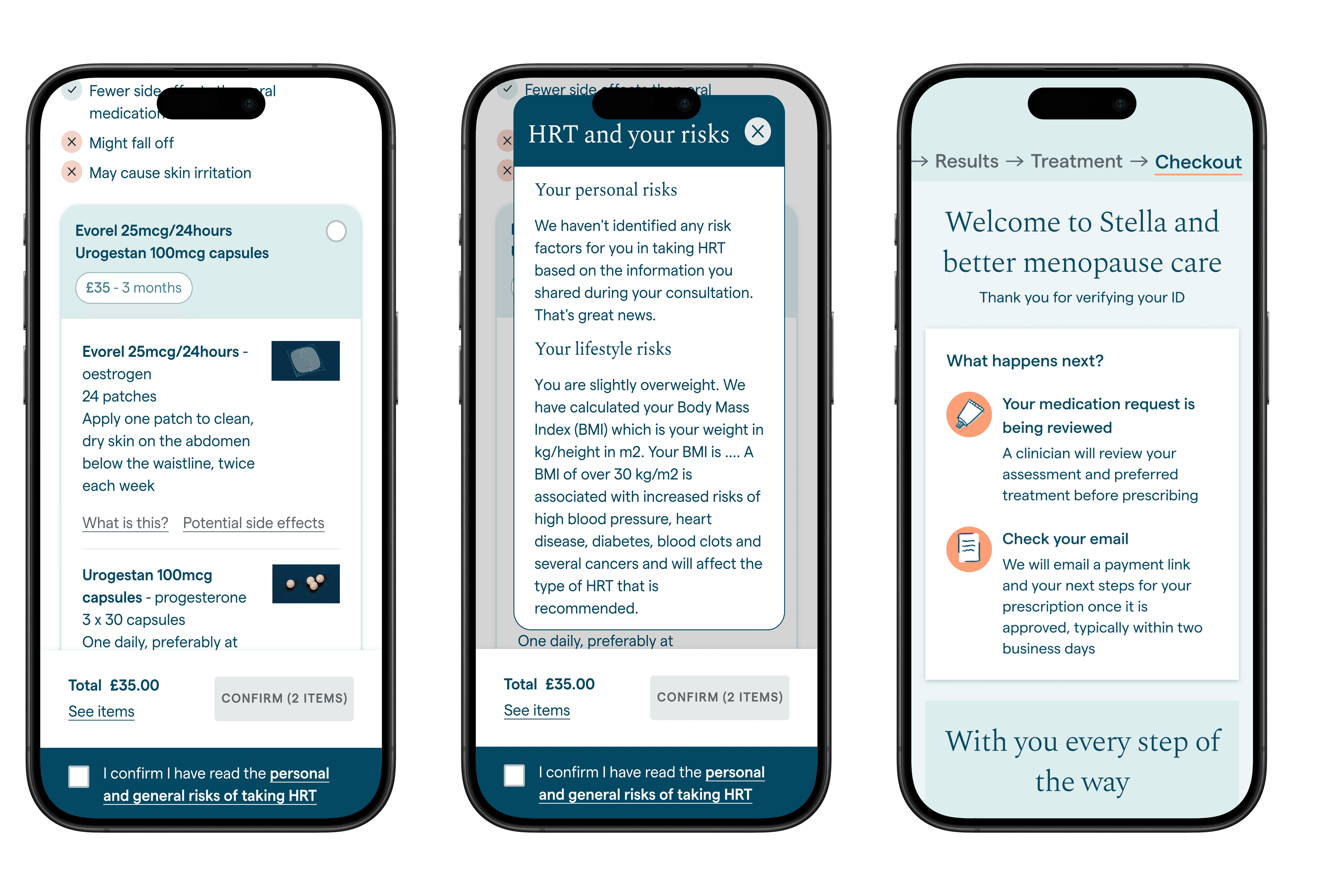
Focus area 3: Redesigning the treatment picker so HRT consent was a decision, not a footnote
For those eligible for medication, the treatment page was a long, dense list of medication options presented immediately after the results page. At the bottom of the page was the HRT risks and benefits. Structurally, this meant users were selecting treatments before they'd seen the information required for informed consent.
I also redesigned the experience to surface the most important information clearly.
Product cards: medication type, dosage and price.
Ideas for product card | Pros | Cons |
|---|---|---|
Drop down for choosing form of medication | Gives user control | Not feasible as each product card will link to pharmacy stock |
Pricing as chips | Green chip draws eye to pricing immediately | Green chip is used in the context of a symptom scale in the design system so may lead to confusion |
Changing the imagery | The imagery is dated and providing visuals of where the HRT is places is helpful | Not feasible with the current scope of work |
2. HRT risks and benefits
Purchasing hormone replacement therapy is not like buying a consumer product - patients need to understand the risks and benefits so they can make an informed choice which did not exist in the current flow.
I made a structural content decision: the HRT risks and benefits section became permanent and must be accepted before moving forward.
⭐ Outcome: A flow that supported informed consent at a critical moment in the journey.
Live prototype
Explore the interactive prototype below.
What I learned
The most important content decisions on this project weren't about the words on screen - they were about sequence, hierarchy, and what a person needed to understand before they could make a good decision.
In health contexts, the order in which you present information is a clinical and ethical question, not just a design one.

Other projects

The Stella app for menopause care
Streamlining the app and assessment product for better menopause care

Tackling ghosting on Muzz
A card-sort forced decision model to adopt healthy closure.

Improving the international recruitment process
A full re-design and new user experience for the Borderless website.